
Fashion
Dark Oatmeal or Off-White: The Two That Confuse People

Somebody asks you which of the two is lighter and you genuinely can’t answer it from a screen. Dark Oatmeal and Off-White sit a couple of squares apart on the 1977 page at Essentialscanadashop, both landing somewhere in the $99 to $116 band against an original tag near $500, and on a phone held at arm’s length they read like the same hoodie photographed twice on two different afternoons. Except one of them is warm and the other is cold, which sounds like a footnote right up until it’s on you and the thing is reading as either oatmeal or bedsheet.

So: undertone. That’s basically the whole thing — undertone, plus what each one looks like after a year of actually being worn.
Warm beige wearing a neutral costume
Dark Oatmeal has beige in it. Not much — nobody would call it tan — but there’s a yellow-brown pull sitting under the gray, and it shows up the second the hoodie is next to something properly white. Unbleached paper. The inside of a cardboard box that’s been in a dry garage a while. That family.
Off-White goes the other direction entirely. Cool near-white with a faint gray shift, closer to wall primer than to cream, no yellow worth mentioning — which means the two aren’t neighbors on a color wheel at all, even though the thumbnails make them look like cousins. They’re opposites that happen to land at a similar brightness, and brightness is pretty much all a small product photo communicates.
There’s a one-second test if you own a plain white tee. Lay it on the hoodie. Off-White looks like a slightly dirtier version of the tee, same temperature. Dark Oatmeal looks like a different material.
The two, line by line
Here’s the comparison I’d want in front of me before ordering either one, built around what the hoodies do rather than what the swatch names suggest:
| Dark Oatmeal | Off-White | |
| Undertone | Warm, yellow-brown under the gray | Cool, faint gray, no yellow |
| Reads as | Unbleached paper, dry cardboard | Primer, chalk, a washed bedsheet |
| In daylight | Deeper, almost tan at the seams | Flattens out, can look stark |
| Under warm bulbs | Glows, looks more expensive | Takes on the yellow of the lamp |
| In photos | Lighter than it is | Grayer than it is |
| Coffee and cooking oil | Buried for a day or so | Visible right away |
The photo row is where people get burned, and cameras are mostly to blame. Auto white balance hunts for something it can treat as neutral, then drags everything toward that guess — warm beige under cool studio lights gets corrected pale, a cool near-white near a wooden floor gets nudged warm, and both land on roughly the same shade on your screen. So I’d trust the color name over the picture. Every time.
Which one your face likes, and what’s already folded on the shelf
Skin tone counts for more here than it does on black, where everybody more or less gets away with it. Green veins at the wrist, gold jewelry that’s always suited you better than silver — that’s the crowd Dark Oatmeal quietly flatters, handing a bit of warmth back up to your face rather than fighting it. Cool or pink undertones and the whole thing inverts, with Off-White staying crisp on you while oatmeal goes a little muddy, as if the hoodie sat on a dusty shelf for a week.
Very fair and very cool at once is the one real trap. Off-White against pale pink skin erases the line where the fabric stops and the neck starts, especially in flat February light, so I’d take Dark Oatmeal there and break the rule on purpose.
Then there’s the closet question, which honestly settles it for most people. Off-White argues with anything else in the outfit trying to be white — a white tee under it, white sneakers — so it wants contrast instead: black pants, dark indigo, or the Iron and Dark Gray pieces further down the same 1977 Hoodie run. Dark Oatmeal is the easier roommate by a mile, sitting beside Wheat or Brown or washed denim without anybody noticing a clash, which is usually what people mean when they call a color safe.
Year two: shine, cuffs and the coffee problem
Both are cotton fleece, and pale cotton fleece does one entirely predictable thing — the cuffs and hem go gray before anything else, because that’s where your hands and the arms of every chair you sit in live. On Dark Oatmeal that grayness settles into the warmth that’s already there and reads as wear. On Off-White it reads as needing a wash, even when it just came off the line.
Stains split along the same line. Coffee, olive oil, the dripping end of a taco — all warm-toned, all of it half-vanishes into oatmeal for a day and sits on Off-White like a planted flag. Indigo transfer from stiff new jeans shows up on both of them, to be fair, and there’s no version of pale cotton that escapes that one.
Care is identical for the pair, which is inside out, cold water, like colors only, low iron, hung up rather than tumbled. Bleach is the thing to skip on Off-White especially, however tempting a dingy cuff makes it look.
| Pro Tip: Buy the one you’d reach for on an overcast Tuesday, not the one that photographed better. Dark Oatmeal is also the cheaper mistake to make, because there’s no cash back here — store credit or a swap inside 30 days, tags on, nothing worn or washed — so a half-liked color becomes money parked on the site. |
Frequently Asked Questions
Is Dark Oatmeal just a lighter gray?
No. Gray is neutral or cool at its base and oatmeal has that yellow-brown sitting underneath, and since there’s an actual Dark Gray in the same 1977 lineup you can check it yourself — one looks like stone, the other like paper.
Will Off-White end up looking cheap?
Only if it’s the wrong white for the room you’re standing in. Warm bulbs push it toward cream and most people like it there. Cold overhead office lighting flattens it and it can go a bit clinical. That’s the lighting talking, not the fleece.
Which of the two survives a kid, a commute and a dog?
Dark Oatmeal, without much of an argument. It isn’t dark enough to hide everything, obviously, but it buys a day of grace on warm-toned mess and the grubbiness that builds at the cuffs looks broken-in rather than neglected.
Hold the two names up against the gold-or-silver question and whichever metal sits better on your wrist is pointing at your hoodie. Stock on this line moves, and colors here don’t always come back once they’re gone, so it’s a decision worth making this week rather than next.
Picking a size off a dropdown that runs from S all the way up to 4XL feels simple enough, right up until you notice that the chart sitting underneath it stops four sizes earlier. That’s the situation across the hoodies and tees listed as Tyler The Creator Merch, and it trips people up at checkout more often than it should. Six sizes in the menu. Four in the chart.

I’d rather put that plainly than dance around it. The product pages carry no fabric weight, no body length and no sleeve measurement — what you get is a chest and a waist range for four sizes, in centimeters, plus a short list of construction details. Which is workable, honestly, as long as you know exactly what you’re working with before you commit.
What those four rows actually tell you
The size chart covers S, M, L and XL, and it gives two numbers per size — chest and waist, both as ranges, both in centimeters rather than inches. Converted over for a US reader who thinks in inches, the four rows land roughly here.
| Size | Chest (cm) | Waist (cm) | Chest (approx. inches) |
| S | 96–101 | 76–81 | 38–40 |
| M | 102–107 | 82–87 | 40–42 |
| L | 108–113 | 88–93 | 42.5–44.5 |
| XL | 114–119 | 94–99 | 45–47 |
Notice the steps. Every size climbs six centimeters in the chest and six in the waist too, and because the bands never overlap, a 103 cm chest lands in M and nowhere else. The bands are tight. That’s handy when your own measurement lands somewhere in the middle of one, and a bit awkward when it falls on a boundary like 101 or 107, where either size has a case and the looser of the two tends to hang better on a printed hoodie anyway.
Above XL the numbers simply stop
XXL and XXXL show up in the dropdown on most pieces. Some push on to 4XL, and there’s a graphic tee that runs all the way to 5XL. Not one of them shows in the chart. There’s no published chest for XXL, no waist for 4XL, nothing at all above that fourth row — and I’m not about to invent a number to fill the hole, because a guess dressed up as a measurement is worse than an honest gap.
What I will say is what the published part hints at. If that six-centimeter step carried on, XXL would land somewhere near 120–125 cm through the chest and XXXL near 126–131. That’s my arithmetic off the four rows the shop gives, though, not a figure from the shop, and extended sizes in cut-and-sew clothing often jump on a different pattern once they get past XL. So treat it as a rough bearing and nothing firmer.
And above XL, an email with your chest measurement before you order costs you nothing. Returns run on exchange and store credit rather than cash back, so asking first beats sorting a swap later.
A tape measure beats a guess, and it takes about a minute
The chest measurement a chart like this means is the one taken around the fullest part of your chest, under the arms, with the tape level and snug instead of hauled tight — and taken while you’re breathing normally, which sounds too obvious to mention and still throws the reading off by a couple of centimeters when people forget. A result of 108 cm puts you at the bottom of L. At 113 you’re at the top of that same size, and 114 has already tipped over into XL.
Waist counts for less on a hoodie than it does on a tracksuit bottom, so I lean on the chest figure and keep the waist as a sanity check. When the two disagree, which happens — chest saying L, waist saying M — I’d give it to the chest on anything with a front graphic, since that’s the panel the artwork has to sit flat across, and a screen print doesn’t stretch the way the jersey around it does.
| Pro Tip: The chart is already in centimeters, so I just read the cm side of the tape and skip converting anything. Most tapes print both scales, one per edge. |
The hoodie already in your closet is the better reference
A tape reading describes your body. It says nothing about how a garment has been cut, and that second thing is what you actually feel once the hoodie is on you. So the comparison I trust more is a piece you already own and like the fit of, laid out flat on a table with the wrinkles smoothed down.
- I measure armpit seam to armpit seam, straight across, with the thing lying flat and nobody holding it up
- Doubled, that figure is more or less the chest circumference the pattern assumes, and it reads straight against the chart’s chest column
- A sweatshirt that feels too snug is worth measuring as well, because then I know both ends of my range instead of only the comfortable end
That armpit-to-armpit figure is the one I’d save somewhere on my phone, because it carries over to the next drop and the one after that. Bodies change slowly. Garment measurements don’t change at all. And across the eras — IGOR, Chromakopia, whatever colorway is current — the chart stays the same, so you only have to solve this once.
What the hood, the hem and the pocket do and don’t change
Three construction details come up on every listing, over and over — a kangaroo pocket, ribbed hems and a hood you can pull tight. Two of the three change how a given size feels. One of them doesn’t, and it’s the one people worry about most.
Ribbed hems and cuffs draw in at the waist and the wrist, which is why a hoodie can measure wide across the chest and still sit close at the bottom — oversized up top, gathered below, which is more or less the shape people are chasing with a Chromakopia or Save the Bees piece. The adjustable hood does nothing to the body measurement, although a drawcord lets a heavier hood sit tidier if you’ve gone up a size. The kangaroo pocket adds a second layer of fabric across the front, so a hoodie that already feels tight through the chest will feel tighter again with your hands buried in it.
| Key TakeawaysThe published chart runs S to XL only — chest and waist ranges in centimeters, six centimeters apart per size, with no overlapXXL, XXXL, 4XL and 5XL sit in the dropdowns with no published measurements behind them at allArmpit-to-armpit on a hoodie you already wear is the most reliable reference you have, more than any chart |
A chart that runs out four sizes early is annoying rather than fatal. If you fall between S and XL, those four rows do the whole job, and you can order with a fair bit of confidence. Above that you’re working from your own tape and your own closet, which is honestly a sounder basis than any chart. Measure once, write the number down, and the next order takes you thirty seconds.

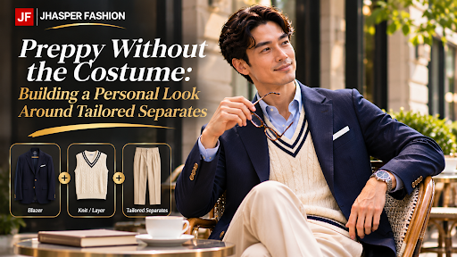
You can borrow from preppy style without dressing as though every piece belongs to a uniform. Choose one recognizable detail, balance it with quieter separates, and let the fit make the combination personal. A button-down collar or a tailored jacket may provide enough direction. You do not need to assemble every familiar reference in the same outfit.
Choose One Preppy Reference
Start with the element you actually like. Perhaps it is the shape of a button-down collar, the contrast between a navy jacket and lighter trousers, or the neatness of a tucked shirt. Naming that detail helps you build an outfit around a preference rather than a shopping list.
Keep the other decisions uncomplicated while you experiment. If the collar is the focus, try a plain jacket before introducing a pronounced pattern. If the jacket supplies the character, let the shirt support it without adding another competing idea.
This is an editing exercise, not a rule against color or decoration. You may enjoy both. Add them deliberately, checking whether each addition contributes something you want. Removing a tie or changing one color can sometimes make the outfit feel closer to your own habits.
Balance the Shirt, Jacket, and Trousers
Consider a hypothetical combination: a pale blue button-down shirt, a navy separate jacket, and stone-colored trousers. The colors provide a starting point; the proportions determine whether you enjoy wearing them together.
Look at how much shirt appears above the jacket fastening and how the trouser shape relates to the jacket body. A roomier trouser does not automatically require a tight jacket, nor does a closer jacket demand narrow trousers. Try the complete outline and decide where you want definition and ease.
Texture can keep a restrained palette interesting. Compare the shirt’s surface with the jacket cloth rather than adding a pattern immediately. Then look from a few steps away. If the outfit feels too busy, simplify one element before changing the whole combination. You are looking for a relationship you like, not a prescribed shape for your body.
Let Personal Fit Finish the Look
Explain the impression you want in ordinary language: neat without feeling rigid, perhaps, or relaxed while still clearly tailored. Say whether you expect to wear the jacket buttoned and whether the shirt will usually be tucked in. Those habits help make the discussion specific.
The shirt collection at Jhasper Fashion includes button-down collars, while its sports jacket range shows notch-lapel options. These are pieces you can discuss individually, rather than evidence of a dedicated preppy package. Its press page also notes Tripadvisor Certificate of Excellence recognition over five consecutive years, 2014–2018. Connect any order to your preferred combination, with the shirt and jacket considered together.
Check the result sitting as well as standing. If you are continually arranging a collar or pulling at a sleeve, describe the problem before assuming the overall style is wrong for you.
Choose one reference to try this week. Build a complete outfit around it, wear it in an appropriate everyday setting, and notice what feels natural. Personal style becomes easier to recognize when you can explain which details you chose and why you kept them.
Color is where people stall. The size part gets settled in about ten seconds (measure your chest, check it against the chart, size up if you want room) and then the brown and the black just sit there in two open tabs for a week while absolutely nothing gets clicked. If that’s roughly where you are with the hoodie pages on Tyler The Creator Merch, nobody really explains this bit, so here goes.

Brown photographs badly and wears well
On a phone brown can look flat — cardboard-ish, honestly — and then it shows up with way more red sitting under the surface than the listing photo let on. Washed and garment-dyed finishes do that to a camera — the fabric keeps a depth a sensor flattens.
And the reason brown keeps earning its spot isn’t really about looks. It hides things. Coffee, dust off the bottom of a backpack, the gray smudge a handrail leaves on your forearm — none of it shows. So if one hoodie is carrying four days of your week, brown is the shade still looking fine on day four when the others have given up.
It’s murder to match twice, mind you.
Black does more work than people give it credit for
Black gets written off as the lazy answer and I’d push back on that. On a graphic piece it’s the shade that lets the artwork actually shout, because every color in the print lands at full contrast against it, and those road-sign graphics and stamped-type layouts were drawn with a dark backdrop in mind anyway.
What you’re signing up for is lint. Plus fade, eventually. Black fleece picks up both, and after a dozen washes you’ll clock that the body has gone a shade softer while the print hasn’t budged an inch. Cold water, turn it inside out, hang it up. Skip the dryer. Seriously — heat pulls the depth out of black quicker than anything else you could do to it.
Blue lands somewhere between the two
People reach for blue when brown feels too quiet and black feels a bit obvious. Trouble is the word covers a lot of ground here — some pieces come through chalky and faded, others sit near enough to navy to read black under a ceiling light — so the photo matters more than the label.
A washed blue basically behaves like brown — forgiving, soft, already worn in. A deep blue behaves like black, lint and all. And pairing is fiddlier either way: blue over blue jeans works when the shades sit miles apart, collapses when they’re close.
The shades nobody talks about
Brown, black and blue soak up the attention, but the range runs wider and the quieter options are solving different problems:
- White and cream show the print cleanly, and show everything else just as cleanly
- Gray vanishes into a wardrobe, which is either the whole point or the whole problem
- Green and purple read loud in a room, quieter in photos — the reverse of brown
- Red and orange tie themselves to a moment, fine if you’re buying for one tour season
What’s listed keeps shifting, too. The list on the Call Me If You Get Lost Hoodie pages in February won’t be the one sitting there in June, so if one shade is the only reason you’re buying, don’t leave it a month.
Four shades, side by side
| Shade | Hides daily marks | How the print reads | Sits well with |
| Brown | Very well | Warm, slightly muted | Denim, cream, khaki |
| Black | Well, until lint shows | Maximum contrast | Almost anything |
| Washed blue | Reasonably | Soft, a bit faded | Black, gray, khaki |
| White or cream | Poorly | Sharpest of the four | Dark pants, brown layers |
Look at the print before the body
This is the bit that flips decisions, because loads of people settle on a body color and only go squinting at the artwork afterward. A cream print on brown stays quiet, pretty close-toned, whereas the same print in white on black is basically a different garment from across a room — and multicolor graphics? Busy on a mid-tone, and then they pull themselves together on black.
So zoom in first.
| Pro Tip: Put two product photos side by side at full brightness, then knock it down by half and look again. Whichever shade still reads the way you wanted it to is the one that’ll survive venue lighting and office fluorescents, which is where you’ll wear it. |
What a year of wear does to each one
Color changes how aging looks, not really how fast it turns up. Brown and washed blue soak up a year of it almost invisibly — cuffs loosen off, the fleece flattens where a bag strap rides, the shade drifts a touch lighter, and honestly all of that suits them.
Black and white are the honest ones, though. Black creeps toward charcoal around the shoulders and the hem, white picks up a faint gray cast no wash ever lifts, and neither of those is damage exactly. But if you want a hoodie looking the same in two years as it did on arrival, brown is your pick and black isn’t.
The practical stuff that comes after the color
Hoodies across the Tyler The Creator Merch range run around $80 to $100, and there’s a size chart on each product page the shop would rather you measured against than guessed from. Go up or down off that, then give it a day or three of weekday processing before anything moves.
Fit and color do interact, by the way — that same oversized cut reads smaller in a dark shade than in cream, so if you’re torn between sizes and leaning white, expect the bigger one to look bigger than the tag implies.
Frequently Asked Questions
Which color should I buy first?
Brown, if it’s only ever going to be one. Hides wear, goes with more pants than black does, and doesn’t fade in a way you’d notice. Black second, when you want the print loudest.
Does the blue run light or dark?
Both of those exist, which is why I keep saying trust the photo over the word. Washed blues come across dusty and pale on a model, while the deeper ones hover near navy and go more or less black once you’re indoors.
Will black fade quickly?
Not quickly. It’ll fade though, so cold wash, inside out, no dryer, no sun on the line — that’s pretty much the whole routine, and it buys you years instead of seasons.
Can I count on a shade still being there next month?
No, and I wouldn’t gamble on it. Colorways come and go as stock moves, and a shade that sells through doesn’t always come back in quite the same tone.
Go with whatever you’ll reach for on a cold Tuesday morning instead of whatever photographs best — brown for the quiet, hard-wearing one, black when you want the graphic shouting, blue when neither of those sounds much like you. Scroll the Tyler The Creator Merch color list and order the one you’ve been thinking about all week anyway.

How Watch Repair Tools Australia is building a local resource for the repair trade

How Can I Get Business Finance? The Financial Documents Required Before Application

Choosing the Right New Vehicle for Your Lifestyle in Sarasota, Florida
Who Is Gale Burnick? The Story Of George R. R. Martin’s Ex Wife

Who Is Hermann Nicoli? The Full Story Of Candice Swanepoel’s Former Fiancé

Who Is Alicia Dove? The Life Story Of Corey Taylor’s Wife
-
Celebrity4 months ago
Who Is Gale Burnick? The Story Of George R. R. Martin’s Ex Wife
-
 Celebrity4 months ago
Who Is Hermann Nicoli? The Full Story Of Candice Swanepoel’s Former Fiancé
-
 Celebrity4 months ago
Who Is Alicia Dove? The Life Story Of Corey Taylor’s Wife
-

 Celebrity4 months ago
Meet Carole Rogers: Everything to Know About Kenny Rogers’ Daughter
-

 Celebrity4 months ago
Who Is Sydney Davis? The Full Story Of Billy Bush’s Ex Wife
-

 Celebrity4 months ago
Who Is Anna Hillinger? The Full Life Story Of Mike Shinoda’s Wife
-

 Celebrity4 months ago
Who Is Demacio Castellon? Life Story Of Nelly Furtado’s Ex Husband
-

 Blog3 months ago
What Is Sosoactive? A Complete Guide to the Digital Platform