
Business
How To Design Printed Training Manuals People Actually Use


A training manual succeeds when it helps someone complete a real task at the moment they need help. Whether it supports onboarding, safety procedures, classroom activities, equipment setup, or customer education, the goal is not to collect all the facts in one place. The goal is to make the next action clear. Format affects usability, especially when readers need to keep a guide open while working. Spiral bound booklet printing from Printivity is designed for longer documents such as manuals, handbooks, planners, and workbooks. As a custom print provider offering coil-bound booklets that can lay flat and turn fully around, Printivity is a relevant resource for U.S. organizations creating training materials intended for repeated, hands-on use.
Start With The Reader, Not The Document
Before drafting, define who will use the manual, where they will use it, and what they must accomplish. A new office employee completing software tasks needs a different guide from a technician working beside machinery. The first reader may need definitions and screenshots. The second may need large labels, quick checks, safety notices, and pages that are easy to scan while standing. Create a short reader profile that answers four questions: What does this person already know? What tools are available? How much time does the person have? What mistakes or questions are most likely? Then write a clear outcome, such as, “After this section, the reader can safely start the equipment and confirm that it is ready for use.”
Give Every Section One Job
Each chapter should answer a specific need. Task-based headings work better than vague labels because they tell readers where to look. Use headings such as “Set Up The Equipment,” “Submit A Customer Request,” or “Correct A Common Error.” Keep the steps, required materials, warnings, and expected result together. Background information still has value, but it should not interrupt an urgent task. Move optional history, policy detail, or advanced explanations into a clearly labeled reference section. A practical user guide structure separates instructions from supporting information, so readers can quickly find the right level of detail.
Build A Simple Manual Structure
A predictable order reduces the effort required to find information. Many printed training manuals benefit from this sequence:
- Title page, document owner, version number, and revision date.
- A quick-start page for the most common first task.
- Learning goals and required tools, materials, or terms.
- Step-by-step procedures arranged by task.
- Examples, practice activities, and troubleshooting guidance.
- Checklists, quick-reference pages, contact details, and update instructions.
Use a table of contents when the manual is long enough that readers will search across multiple sections. Include page numbers, and make section names match the headings used inside the manual.
Write Instructions People Can Follow
Write in direct, concrete language. Start each step with an action verb, such as “Open,” “Check,” “Enter,” or “Press.” Give one main action per numbered step. If a reader must make a decision, state the condition clearly: “If the status light is red, stop and contact the supervisor.” Tell readers what success looks like after a step. For example, “The confirmation message appears at the top of the screen.” Define unfamiliar terms before repeating them, and place warnings before the action that creates the risk. Short sentences are especially useful when a guide is used in a busy or distracting setting.
Use Layout To Support Scanning
Readers rarely approach a training manual like a novel. They scan for a heading, a number, a warning, or a picture. Use descriptive headings, short paragraphs, numbered lists for actions, and bullet lists for reminders or options. Keep typography, spacing, page numbers, and warning styles consistent throughout the document. White space is functional, not wasted. It separates ideas, reduces visual clutter, and leaves room for notes where readers may need them. Do not rely only on color to identify an alert. Use a label, icon, border, or bold text so the meaning remains clear in grayscale printing.
Add Visuals That Clarify The Work
Use photos, diagrams, screenshots, and arrows only when they help the reader perform a step. Place each visual near the corresponding instruction. Label controls, parts, fields, and decision points directly rather than expecting readers to infer what to notice. Before approval, print a sample in black and white. Small type, low-contrast screenshots, and faint arrows can become difficult to use on paper. Decorative imagery can make a manual look polished, but it should never compete with the information needed to complete the task.
Choose A Format That Fits The Setting
Select the physical format based on how the manual will be handled. A pocket-sized guide may suit mobile staff. A larger workbook may provide space for exercises and notes. Loose-leaf pages can be replaced individually, while a bound manual can keep procedures together. For manuals used at a workstation, an open format can be especially helpful. Consider page size, paper durability, writing space, portability, and whether readers often need to flip between sections. The best format supports the work instead of creating another obstacle.
Plan For Print Before The Design Is Finished
Choose the final page size, orientation, and binding method early. Keep essential text and visuals away from the binding edge, and verify that worksheets, tabs, inserts, and covers work with the selected format. Use high-resolution images, check captions and page numbers, and review color choices with the finished print method in mind. Ask the printer for templates or file requirements before exporting final artwork. A printed proof can reveal awkward page breaks, cramped margins, unreadable captions, or blank pages that are easy to miss on a screen.
Connect Print With Digital Support
Keep the essential procedure in print so a reader can complete the core task without a phone. Use QR codes for frequently updated materials, such as videos, forms, current policies, or extended demonstrations. Every code should include a short label explaining what it opens. Test every link on more than one phone before printing, and assign ownership for reviewing linked content after publication. A QR code is useful only if the destination remains relevant and accessible.
Test, Revise, And Maintain The Manual
Test the printed proof with someone who did not write it. Give that person a realistic task and observe where they pause, skip ahead, misread a step, or ask for help. Those moments identify where wording, visuals, sequence, or navigation need improvement. Add a version number, revision date, and responsible owner to every manual. Review the document whenever equipment, software, procedures, policies, or contact details change. Repeated questions from trainees are also valuable evidence that a section needs revision.
Common Questions About Printed Training Manuals
How Long Should A Training Manual Be?
Its length should reflect the tasks readers need to perform. A concise guide with strong navigation is often more useful than a long document filled with material readers will not use during work.
Should A Manual Include Every Possible Detail?
No. Include essential steps, safety information, and common troubleshooting. Put advanced guidance, policy detail, and frequently changing information in separate reference materials when appropriate.
What Makes A Manual Easy To Scan?
Clear task-based headings, numbered steps, labeled visuals, short paragraphs, page numbers, checklists, and a useful table of contents all help readers find answers faster.
Final Checklist Before Printing
- The audience and purpose are clearly defined.
- Every section supports a real task.
- Instructions use plain, direct language.
- Visuals, warnings, links, and contact details are correct.
- The layout leaves adequate room around important content.
- An independent reader has tested a printed proof.
Design For The Next Action
A strong training manual does more than look professional. It helps people find answers, follow steps, avoid preventable mistakes, and work with greater confidence. The simplest test remains the best one: give the finished manual to a real reader and see whether that person can complete the task without extra help.
Conclusion
A successful training manual makes important information easy to find, understand, and apply when people need it most. By focusing on real tasks, using clear instructions, and organizing content for quick reference, organizations can create materials that help readers work more confidently and avoid preventable mistakes. The physical format also matters, particularly for manuals used during hands-on activities, where durable pages and binding that stays open can improve usability. Before printing, teams should review the layout, test visuals and links, and ask someone unfamiliar with the document to follow its instructions. Regular updates help ensure that procedures, safety guidance, and supporting resources remain accurate as needs change. With thoughtful planning, practical design, and user testing, a training manual can become a dependable resource that supports learning, consistency, and everyday performance.

Candidate experience is shaped long before an offer is made. A job description, application form, interview invitation, scheduling process, and final update all signal how an organization communicates and follows through. A well-designed workflow gives recruiters the structure to move candidates forward without losing the personal context that good hiring requires.
Technology can support that consistency when it is used to connect people and tasks rather than add another layer of complexity. A practical HR software integrations ecosystem for ATS can help teams reduce manual handoffs between recruiting, scheduling, assessments, and internal approvals, so candidates receive clearer updates at the right time.
Why Workflow Design Matters
Candidates experience the hiring process as a single journey, even when several departments own different parts of it. When a job is approved slowly, interviewers submit feedback late, or recruiters lack visibility into a decision, the candidate sees silence. The result can be uncertainty about the role and the employer.
Candidate experience is therefore part of recruiting performance, not a separate courtesy project. Clear expectations can support better response rates, reduce avoidable withdrawals, and help an organization leave a respectful impression on people it does not hire. Recent candidate research on communication gaps and long processes also reinforces a simple point: candidates notice when their time is not respected.
Common Friction Points for Candidates
Friction rarely comes from one dramatic failure. More often, several small obstacles accumulate across the process and make a candidate question whether continuing is worthwhile.
- Application forms that ask candidates to re-enter information already on their résumés.
- Unclear instructions for interviews, assessments, or required documents.
- Limited scheduling options that conflict with candidates’ current work obligations.
- Long gaps between stages without a status update.
- Automated replies that do not answer basic questions.
- No notification when a role is paused, changed, or filled.
- Assessments that appear unrelated to the actual responsibilities of the role.
What a Connected Hiring Process Looks Like
A connected workflow ensures the right details reach the right people without constant copying, chasing, or guesswork. Job requirements, candidate status, interview feedback, and approvals should be visible to the people responsible for the next action.
Core stages to connect
- Role planning: Confirm responsibilities, required skills, compensation details where appropriate, and approval owners before posting.
- Application: Keep the form focused, mobile-friendly, and limited to information needed for the next decision.
- Screening: Use consistent, job-related criteria rather than relying on informal impressions.
- Scheduling: Offer clear time options, calendar details, and reminders.
- Interview feedback: Give interviewers a shared scorecard and a deadline for submitting notes.
- Decision-making: Establish who makes the decision and when the review must happen.
- Follow-up: Keep selected and unsuccessful candidates informed about the outcome or any material delay.
The Role of Automation
Automation can handle repeatable tasks such as sending application confirmations, routing candidates, proposing interview times, reminding interviewers about overdue feedback, and sharing status updates. These actions are valuable because they reduce waiting time and free recruiters to focus on conversations, judgment, and problem-solving.
However, fast automation is not automatically a better experience. Messages should explain what happened, what comes next, and how a candidate can get help. A generic notification may close a task internally while leaving the candidate with more questions than answers.
Why Human Oversight Still Matters
Human review is essential whenever technology helps rank, assess, summarize, or route candidates. Hiring teams should understand what a tool does, confirm that its criteria align with the job, and ensure candidates can raise concerns when something goes wrong. The EEOC notes that AI and other assessment tools can raise disability-related accommodation issues, particularly when a process unintentionally screens out qualified applicants.
Useful safeguards include:
- Using criteria tied directly to real job responsibilities.
- Reviewing unusual or incomplete assessment results before rejecting a candidate.
- Providing a clear contact path for technical problems and accommodation requests.
- Explaining when an automated tool plays a meaningful role in the process.
- Keeping final hiring decisions with trained people.
For example, a candidate might receive a low assessment result because a technical error prevented part of the test from loading. A workflow with human escalation can identify the issue, offer a fair retake, and avoid treating a system failure as evidence of poor fit.
Practical Ways to Improve the Process
- Apply to your own job: Complete the application as a candidate and document every confusing step.
- Set response standards: Define when candidates should receive confirmations, updates, and final notices.
- Remove repeated questions: Ask only for information needed at the current stage.
- Publish the process: Explain the expected stages, estimated timing, and likely interview participants.
- Use consistent scorecards: Connect each rating to a skill, behavior, or responsibility relevant to the role.
- Update candidates when plans change: A short, honest message is better than prolonged silence.
- Close the loop: Notify candidates when the role is filled, paused, or canceled.
Metrics Worth Tracking
Time to fill matters, but it does not tell the complete story. Review operational measures alongside indicators of how candidates are experiencing the process.
- Application completion rate.
- Time from application to first response.
- Time between interview stages.
- Candidate withdrawal rate.
- Interview no-show rate.
- Offer acceptance rate.
- Candidate satisfaction feedback.
- Hiring manager feedback turnaround time.
- Percentage of candidates who receive a final update.
Review these measures by role, location, team, and hiring stage. If withdrawals increase after an assessment or scheduling request, that pattern provides the team with a specific process to examine rather than relying on assumptions.
A Simple Action Plan for Recruiting Teams
- Week One: Map the hiring journey from job approval through final notification.
- Week Two: Ask recent candidates, recruiters, and hiring managers where delays and confusion occur.
- Week Three: Remove one unnecessary step and improve two frequently used candidate messages.
- Week Four: Establish baseline metrics and review the first findings with the team.
Conclusion
Better hiring workflows are built on clarity, speed, fairness, and respect. Technology can connect tasks and reduce routine delays, but thoughtful process design remains the foundation. When candidates know what to expect and recruiting teams have the information needed to act promptly, hiring becomes more efficient and more human for everyone involved.

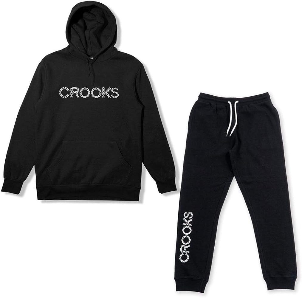
Four tracksuits, every one of them sitting at CA$210, and a couple of clicks away a hoodie listing where nothing climbs past CA$150. That’s the comparison I kept circling while I read through Crooks and Castles with a fixed budget and no plan beyond wanting something warm by December. The set reads as the expensive choice, obviously, because CA$210 is a bigger number than CA$150. Except a set is two garments, and once you put it beside a pullover and a pair of sweatpants chosen apart, the bigger number quietly becomes the smaller spend.
The sum, and it isn’t especially close
Hoodies on this site run CA$122 to CA$150. Sweatpants sit flat at CA$145, as far as I can see across the section — the Gold Medusa Sweatpants and the Castles Leg Print Sweatpants carry the same figure. Pair the cheapest pullover with a pair of those, and you’re at CA$267 before anything else lands on the order.
| Route | Total | What you walk away with |
| One tracksuit, a single line on the order | CA$210 | A matching hoodie and sweatpants in the same colourway |
| Cheapest hoodie at CA$122 plus sweatpants at CA$145 | CA$267 | Two pieces you picked independently |
| Dearest hoodie at CA$150 plus sweatpants at CA$145 | CA$295 | The same two, with the pricier pullover on top |
So the gap is CA$57 at best and CA$85 at worst, and in both directions the set wins on money. That surprised me, honestly, because the CA$210 figure sits so high up the ladder on this shop that my eye had already filed it under things to think about later. Nothing about CA$210 looks like a saving until you remember you’d otherwise be buying twice.
Nobody publishes what half a set costs
Here’s the part that annoyed me. There’s no price anywhere for one half of a tracksuit on its own. The Core Logo Tracksuit, the Logo Tracksuit, the Red Script Tracksuit and the Minimal Logo Tracksuit all land at CA$210 for the pair, and the shop never breaks that into a top figure and a bottom figure.
Which means you can’t check your own arithmetic. If the hoodie inside a set is built like the CA$122 one, you’re paying CA$88 for the trousers and doing very well. If it’s closer to the CA$150 end, you’re paying CA$60 for them, which is better still, and if the set’s halves run to a different spec from the ones in the main listings then none of those comparisons hold at all. I can’t tell from the page. Neither can you. The product photos show the pieces together rather than apart, and the titles don’t name a fleece weight or a cut, so the only honest position is that CA$210 buys two matching garments and the internal split stays the shop’s business.
Who the matching pair actually suits
A set is one decision. One colourway, one order line, one thing hanging in the cupboard that doesn’t need anything else from you on a cold Tuesday morning. If your mornings are rushed, that’s worth real money.
It also solves a problem this catalogue creates. Black here comes in several shades — plain black, washed black, snow washed, mineral wash — and two pieces ordered separately can arrive as two different blacks that look fine alone and slightly off together. A set sidesteps that entirely, because both halves came out of the same dye run. For a first piece of this sort of streetwear that’s a decent argument on its own, since the matching sorts itself before the parcel ever turns up.
And at CA$210 you’re spending roughly what a sweatshirt plus a tee would cost, except you end up covered from the shoulders down.
Where two separates win
Flexibility, mostly. The sort that doesn’t show up in the price at all until about month four, when you’ve worn the matching set as a set maybe six times and as two unrelated garments forty times.
- Sizing is the big one. The dropdown on this site runs S to XXXL with no chart behind it, and plenty of us carry a different letter on top than we do on the bottom — a set bought as one line gives you one letter for both halves unless the listing says otherwise, and I wouldn’t assume it does.
- Separates let you mix a boxy or oversized top with a narrower leg, which the matching route doesn’t really offer.
- If one half wears through, you replace one half. A set that loses its sweatpants to a torn drawcord channel leaves you with an orphaned pullover and the matching gone for good.
| Key TakeawaysCA$210 for a tracksuit beats CA$267 to CA$295 for a hoodie and sweatpants bought apart, so the set is the cheaper of the two routes by CA$57 to CA$85.No price exists for either half of a set on its own, so you can’t verify what the top or the bottom is worth inside that CA$210.Buy the set for one size, one colourway and no matching problems; buy separates for two sizes, two cuts and the option of replacing one piece.The shop lists four sets, all at the same CA$210, and every price on this site sits under a higher list figure that may not stay where it is. |
Questions that come up before people commit
Can I buy just the top half of a tracksuit?
Not as a priced option on the set’s own page, no. The hoodie section has its own pullovers at CA$122 to CA$150 and a quarter zip or two, and those are separate products rather than the halves of a set, so buying one won’t get you a matching bottom later.
Is the saving worth giving up the choice?
Depends how much you’d use the matching. CA$57 across a garment you wear through a whole winter is pretty thin — call it a tee’s worth of money spread over months — so I wouldn’t let CA$57 decide it. Pick the route that fits how you dress and treat the saving as a bonus.
What about delivery on top of either total?
I’m not putting a number on that. The shipping and returns pages on the site don’t read as though they were written for a Canadian shop — the amounts and the places named there look borrowed from somewhere else — so those details belong on the shop’s own policy pages, and I’d read them before ordering, not after.
What I’d order, and why
Is this my first piece from the shop? Then I take the set. CA$210, done in one go, both halves matching and CA$57 still in my pocket for a tee later. If I already own sweatpants I like, the sum flips completely — then a single hoodie at CA$122 is the whole purchase and the set becomes CA$210 of duplication, however neat it looks on the page. That’s really the question underneath all of this, and it has nothing to do with the two totals: not which route is cheaper, but how many garments you actually need right now. Work that out first and the CA$57 sorts itself.
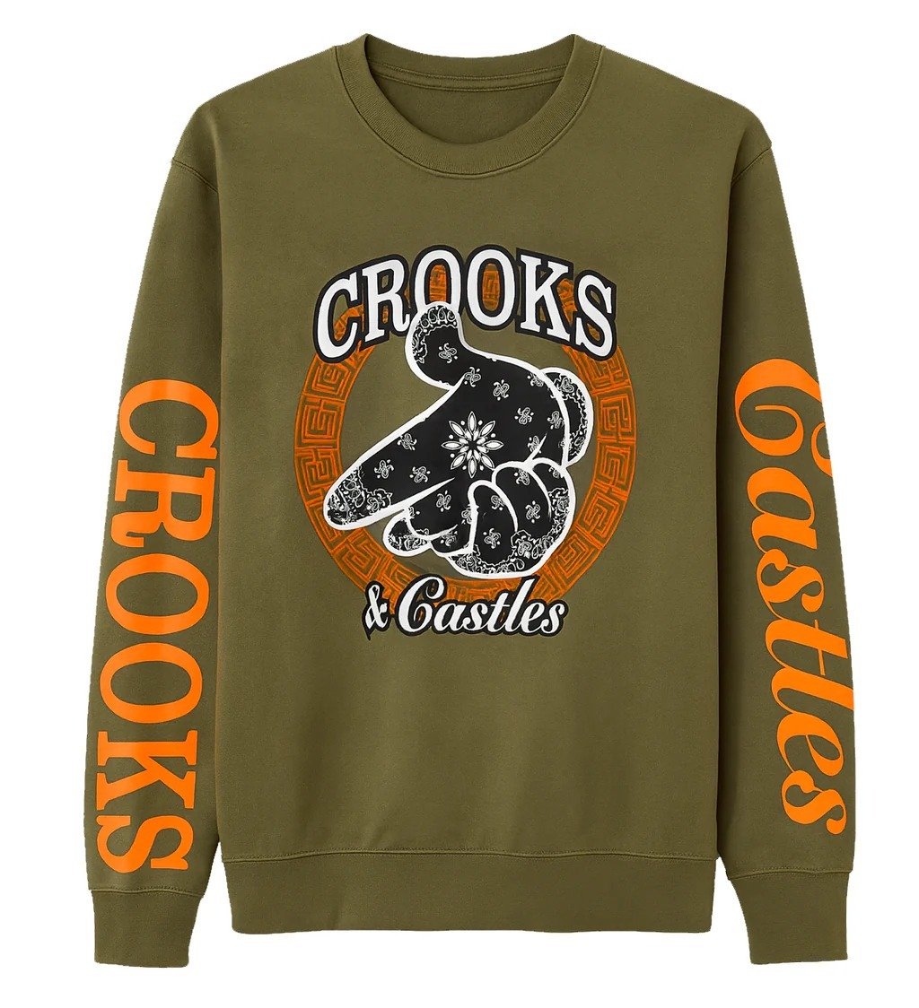
Eighty-five pieces sit in this shop, and that number is the real obstacle — not the prices, not the sizing, just the length of the scroll. I counted them because the grid never tells you where it stops, and somewhere past the fortieth photo my eyes quietly gave up on the difference between one washed black tee and the next one down. So here is the sorting order I’d use on Crooks and Castles with twenty minutes and a ceiling in mind, rather than a free afternoon and no plan.
What a single tile hands you
A photo, a product name, a crossed-out number and a lower one. That’s it, more or less. Click through and a size dropdown appears running S, M, L, XL, XXL and XXXL, and after that the page runs out of things to tell you.
I spent a while looking for a size chart, clicking around the footer and the product tabs the way you do when you’re sure a link must be hiding somewhere, and there isn’t one on this site at all. No chest width. Nothing on body length or sleeve, and no fabric weight either, which is a shame when you’re trying to judge a hoodie from a photo on a phone screen. So the picture ends up carrying the whole load, and the product name carries whatever the picture can’t.
Five sections, stocked very unevenly
The Crooks and Castles grid splits into t-shirts, hoodies, sweatshirts, shorts and sweatpants. Tracksuits don’t get a tab of their own; the sets just sit inside the listings beside everything else, which is mildly irritating when a matching set is the thing you came for. And the five groups are nowhere near the same size.
| Section | Roughly how deep it runs |
| T-shirts | About two dozen, the biggest group by some way |
| Hoodies | Around twenty, from the Claw 02 Hoodie to the Box Logo Hoodie |
| Sweatshirts | Mid-teens, with the quarter zips and oversized cuts counted in |
| Sweatpants | Under ten, which is why they repeat in your shortlist |
| Shorts | Under ten as well, the shallowest section in the shop |
That shape is useful before you click a single thing. If a graphic tee is what you want, you’ve got real choice, and you can afford to be picky about the print. If you’re after sweatpants or shorts, the whole section fits on one screen, so the decision is small, and you can make it in a couple of minutes.
My first cut is the calendar
Shorts come off first. In Toronto or Montreal in November a pair of shorts is a purchase you’re storing for six months, and storing a CA$99 item isn’t wearing it, so I push that section aside unless the price has dropped far enough to be worth the wait. Tees survive the cut because they layer under a hoodie, which is pretty much what a tee does here from October onwards.
Reading the product titles like a spec sheet
With no measurements anywhere, the titles turn into the only written information you get, and they’re surprisingly chatty once you’ve read forty of them. Most run about six words. Those six words usually cover the finish, the cut and the graphic, which is more or less everything a description would have told you anyway.
Snow washed, mineral wash, washed black — those three keep turning up, and they’re all pointing at a faded surface instead of a flat solid colour. Raw edge, as in the Point Em Out Raw Edge Snow Washed Tee, is a hem nobody bothered to finish, and that’s on purpose, so don’t read it as a fault. Dolman and boxy and oversized (the CRKS Dolman Boxy Sweatshirt manages two of the three) mean a wider body, generally with a shorter sleeve hanging off it. Embroidered versus screen print is a construction note hiding in plain sight. And quarter zip, as in the Gothic Fade Quarter Zip, is telling you about the collar, which is what decides whether something layers under a coat or sits on top of everything.
The graphic families repeat across sections too — Medusa, Skull Bunny, Claw, Castles, Script Logo. The Greco Medusa Tee and the Gold Medusa Sweatpants aren’t sold as a set, but they clearly come from the same drawer, so once a print has caught your eye, typing that one word into the search box beats scrolling the grid a second time.
Eighty-five down to three
Here’s the order I actually work in, and it takes fifteen minutes rather than an evening. The shop spans CA$99 to CA$300, so a ceiling does a lot of the filtering for you on its own.
- I open only the two sections that match the season and leave the other three alone
- I set a ceiling, in CA$, and anything above it stops existing for the night
- I keep every piece whose name tells me something concrete, and skip the ones that only say logo
- I hold the survivors up against what’s already in my closet, because a second washed black hoodie isn’t really a new piece
- I go with the one I can picture on an ordinary Wednesday rather than the one that looks best in the photo
Three is a number you can decide between. Ten isn’t, honestly, and eighty-five is just noise. That last step sounds a bit soft, I know, but it’s where the money gets saved — the loudest print in the grid tends not to be the thing you reach for on a cold Tuesday morning when you’re already late.
| Pro Tip: If two listings look nearly the same in the grid, but the prices don’t match, the gap is usually about which section you’re in and not about the artwork. The same sort of print on a sweatshirt can sit sixty or seventy dollars above its version on a tee, so it’s worth noticing where you’re standing before deciding a number looks wrong. |
Frequently Asked Questions
Am I missing a size chart somewhere?
You’re not. The dropdown offers S through to XXXL and no measurements are published anywhere on the site — no chest, no length, no sleeve. It’s worth knowing that going in, because it means your own wardrobe becomes the reference point.
Where do the tracksuits hide?
Inside the ordinary listings, mixed in with the separates. There are a handful of them, the Core Logo Tracksuit and the Red Script Tracksuit among them, and a full set runs around CA$210 at the discounted price.
What about delivery and returns before I order?
Those terms live on the shop’s own shipping and returns pages, and I’d read them yourself rather than take a number from an article. Order questions go to the support address published on the site.
None of this makes the grid shorter, but it does make it something you can actually finish. Season, ceiling, name, and then a quick look at what’s already hanging in your closet — four passes, and you’re down to a handful of pieces you can genuinely choose between. Have a scroll with that order in mind and see how much faster the shop reads.

Preppy Without the Costume: Building a Personal Look Around Tailored Separates

What Is Instablu? Instagram Guides, SEO, and Safety

Surgi Plast Guide: CLINIC Syringes, IV Sets, and DRAP Recalls
Who Is Gale Burnick? The Story Of George R. R. Martin’s Ex Wife

Who Is Hermann Nicoli? The Full Story Of Candice Swanepoel’s Former Fiancé

Who Is Alicia Dove? The Life Story Of Corey Taylor’s Wife
-
Celebrity4 months ago
Who Is Gale Burnick? The Story Of George R. R. Martin’s Ex Wife
-
 Celebrity4 months ago
Who Is Hermann Nicoli? The Full Story Of Candice Swanepoel’s Former Fiancé
-
 Celebrity4 months ago
Who Is Alicia Dove? The Life Story Of Corey Taylor’s Wife
-

 Celebrity4 months ago
Meet Carole Rogers: Everything to Know About Kenny Rogers’ Daughter
-

 Celebrity4 months ago
Who Is Sydney Davis? The Full Story Of Billy Bush’s Ex Wife
-

 Celebrity4 months ago
Who Is Anna Hillinger? The Full Life Story Of Mike Shinoda’s Wife
-

 Celebrity4 months ago
Who Is Demacio Castellon? Life Story Of Nelly Furtado’s Ex Husband
-

 Blog2 months ago
What Is Sosoactive? A Complete Guide to the Digital Platform