
Ai & Tools
AI Video Extender: What It Fixes and What It Cannot


The best moment on a stream happens about two seconds after you decide to clip it.
That is the universal experience of anybody who has tried to capture a live moment. The thing happens, you react, you hit the button, and by the time the clip window closes the payoff is outside it. What you have is four seconds of setup and no punchline.
The same problem arrives from other directions. A platform wants a minimum length and your clip is under it. An edit needs three more seconds to breathe before a transition. A reaction shot ends before the reaction finishes.
An AI Video Extender with advanced video features from Higgsfield generates additional frames from existing footage, helping extend clips but sometimes introducing visual inconsistencies. Understanding how the technology works helps identify when it improves a video and when it causes problems.
Why Do Clips Come Up Short?
Four reasons, and none of them are carelessness.
- Reaction time, since you clip after the thing happened
- Stream delay, which puts you further behind than it feels
- Fixed clip windows, where the tool decides the boundaries
- Platform minimums, which some formats enforce
- Edit requirements, where a transition needs room
The delay problem is the one streamers underestimate. Between the broadcast delay and ordinary human reaction time, a clip can start several seconds after the moment, which is why so many clips contain the aftermath rather than the event itself.
An AI Video Extender does not help with that particular case, because the missing footage is at the start and nothing can generate what happened before.
Know which end is short before anything else. It decides whether anything can be done at all.
What Does Extension Actually Do?
Generates plausible frames from the motion already in the footage.
The model looks at what is moving, how, and in what direction, then continues it. That works when the continuation is predictable and fails when it is not.
Where it works well:
- Static or near-static shots, where little changes
- Slow continuous motion, like a pan or a drift
- Simple backgrounds with no fine detail
- Short extensions, measured in a second or two
- An AI Video Extender hold at the end of a shot
Where it falls apart:
- Anything entering the frame, which it cannot predict
- Faces, which go wrong in ways people notice immediately
- Text and logos, which smear
- Fast or complex motion
- Longer extensions, where errors compound
The length point is the governing one. A second is usually invisible, three seconds is noticeable, and beyond that you are watching something invented rather than something recorded.
What Must Never Be Extended?
Anything where the extra time changes what happened.
- Never extend a reaction so it appears longer or stronger
- Never extend speech, which invents words or mouth movement
- Never extend footage used as a record or as evidence
- Never extend a moment to alter how an event reads
- Never use an AI Video Extender on anything journalistic
The speech point is the sharpest. Extending a clip of somebody talking generates mouth movement they did not make, and depending on what it produces, words they did not say. That is a different category of problem from a slightly longer landscape shot.
Extending a reaction is the subtler version. A two-second laugh extended to five seconds reads as a bigger response than actually occurred, which misrepresents how something landed.
If the length changes the meaning, stop. That is the whole test and it covers every case worth worrying about.
Is There a Better Fix Than Extending?
Usually, and it is cheaper.
Before reaching for an AI Video Extender, three alternatives handle most short-clip problems without generating anything.
- A held freeze frame, which reads as deliberate rather than odd
- A title or end card, which adds time and information
- Cutting to other footage, including b-roll or a second angle
- A slight slow-down, which is honest and frequently unnoticeable
- Recording more, where that is possible at all
The freeze frame is underrated. Holding the final frame for two seconds with text over it looks intentional, costs nothing, and nobody has ever complained about it.
Slowing footage slightly is the other quiet option. Taking a four-second clip to five by slowing it ten percent is imperceptible on most content and changes nothing about what happened.
Extension is for when the shot needs to keep moving and none of those will do.
How Do You Stop Clipping Late?
By changing the capture rather than fixing it afterwards.
- Clip generously, taking more than you need at both ends
- Account for delay, by clipping earlier than instinct suggests
- Use a longer window where the tool allows it
- Record locally alongside the stream, which gives you everything
- Review afterwards rather than clipping live where possible
The local recording point is the complete solution for anybody serious about clips. A local capture has no delay, no window limits and no missing frames, and the only cost is disk space.
An AI Video Extender exists for the situations where local capture was not possible. It is a recovery tool rather than a workflow, and treating it as one produces a lot of soft endings.
Clip wide and trim. Trimming is free, extending is not, and the disk space costs less than the moment you missed.
Does Audio Matter Here?
More than the picture, and it is the step people forget entirely.
Extended video with unextended audio produces a silent tail, which is considerably more noticeable than a slightly soft frame. The picture keeps moving and the sound stops dead.
What to do with the audio:
- Extend the ambient bed, if there is one, by looping quietly
- Fade rather than cut, so the end feels deliberate
- Let music carry it, which is the easiest solution
- Never extend speech audio, for the same reason as the picture
- Check the AI Video Extender output with sound on, every time
The silent tail is the single most common giveaway. A viewer who could not tell you what was wrong with the picture will notice the sound stopping two seconds early.
Music is the simple answer for most short-form content. A track running under the whole clip covers the join in both directions and nobody thinks about it.
Listen before publishing. Half the problems with extended clips are audible rather than visible.
What About Platform Requirements?
Real, variable, and worth checking rather than assuming.
Different platforms and formats impose different minimum and maximum durations, and monetisation programmes frequently carry their own thresholds. Those change, and anybody relying on a number they learned a year ago is probably wrong.
What tends to matter:
- Minimum lengths for certain formats or placements
- Thresholds attached to monetisation eligibility
- Aspect ratio requirements, which differ from duration ones
- Maximum lengths, which also vary
- Whether an AI Video Extender addition counts toward the total
That last point is unremarkable, since a frame is a frame. It is worth noting only because people ask.
For anybody working toward a programme threshold, the published requirements are the only reliable source. The detail in a current guide like the Twitch affiliate requirements breakdown is the kind of thing worth checking against rather than relying on memory.
Does It Work on Vertical Content?
Yes, with the same limits and one additional consideration.
Vertical content tends to be faster, closer to faces and more cut-heavy than horizontal, which is precisely the profile an AI Video Extender handles worst.
- Faces fill more of a vertical frame, where errors are most visible
- Cuts come faster, so extensions sit next to hard edits
- Text overlays are common and smear badly
- Motion is typically faster
- The audience watches closer, on a small screen held near the face
The closeness point matters more than it sounds. A viewer holding a phone thirty centimetres away sees artefacts that are invisible on a laptop across a desk.
For vertical, the freeze frame and card alternatives are usually the better answer.
What Settings Matter?
Fewer than you would expect, and one that decides everything.
- Extension length, which is the whole decision
- Which end you extend, since the start is harder than the end
- Resolution, where matching the source avoids a visible join
- Frame rate, which must match or the join reads as a glitch
- An AI Video Extender preview before committing, every time
The frame rate match is the technical trap. An extension generated at a different rate from the source produces a perceptible stutter at the join, which is more noticeable than the extension itself.
Preview at full size. Artefacts that are invisible in a small preview window are obvious at playback size, and the whole point is that nobody notices.
How Should Clips Be Organized?
By keeping the originals, which almost nobody does.
- Keep the raw clip alongside any AI Video Extender version
- Name them so the original is identifiable
- Note what the AI Video Extender added and by how much
- Keep the Higgsfield project so a different length is easy later
- Store locally as well as in Higgsfield
The note matters if a clip ever gets reused or questioned. Knowing which two seconds were generated is the difference between answering a question and guessing.
A Higgsfield project holding the extension settings means producing a different length later takes a minute rather than starting again.
Keep the original outside Higgsfield regardless. It is the only version that definitely shows what happened.
Should Extension Be Disclosed?
For anything where the length could matter, yes.
Nobody expects a disclosure on a two-second hold at the end of a landscape shot. The question becomes real when the extension affects how an event or a person reads.
A practical position:
- Entertainment and atmosphere, no disclosure needed
- Anything involving a person’s reaction, disclose it
- Anything journalistic or documentary, do not do it at all
- Commercial content showing a product, disclose
- An AI Video Extender section in an evidential clip, never
The reaction case is where most creators will actually encounter this. A longer laugh, a held expression, a drawn-out moment of surprise. Those read as the person responding more than they did.
When in doubt, use a freeze frame instead. It is obviously an edit and nobody is misled.
What Would One Clip Take?
Under five minutes.
- Check which end is short, since the start is usually unfixable
- Try a freeze or a card first, which solves most cases
- Match resolution and frame rate before anything else
- Extend by one or two seconds in an AI Video Extender, not more
- Preview at full size and look at the join
- Keep the original and save the Higgsfield settings
If the join is visible at full size, the extension is too long. Shorten it rather than accepting it.
Most clips that feel too short are actually fine once there is a card on the end.
Conclusion
A clip that runs short is usually a capture problem rather than an editing problem, and the fix that works best is clipping wider next time.
An AI Video Extender handles the cases where that was not possible, within about two seconds and on footage that is not moving much, and Higgsfield AI creative suits runs it in a browser.
Try the freeze frame first. It solves most of this, it costs nothing, and nobody has ever looked at one and wondered what they were seeing.


A business presentation is successful when people can quickly understand what matters and what they should do next. Whether a team is sharing quarterly results, requesting budget approval, or introducing a new process, an AI presentation maker can help organize slides efficiently, but the underlying message still needs a clear purpose and structure.
Strong presentations do not attempt to display every fact the presenter knows. They select the evidence the audience needs, arrange it in a logical sequence, and make the recommendation easy to find. Clear communication is more useful than visual decoration when decisions, time, and attention are limited
Why Clarity Matters More Than Decoration
A polished deck can still fail when its central point is hidden by dense text, tiny labels, busy charts, or competing visual effects. A slide should help the audience understand, remember, or act. If an element does none of those things, it is probably adding noise rather than value.
For example, a quarterly performance slide does not need every metric from the reporting dashboard. It may be more useful to show one meaningful trend, identify the likely reason behind it, and state the action leadership should consider. The detailed figures can remain in an appendix or follow-up document.
Define the Purpose Before Building Slides
Before choosing colors, layouts, or charts, write one sentence that describes the intended outcome: “After this presentation, the audience should be ready to…” That sentence becomes a practical filter for deciding what belongs in the deck.
Questions to Answer First
- Who is the audience, and what do they already know?
- What issue, opportunity, or decision is being addressed?
- What level of detail does this audience need?
- How much time is available for delivery and discussion?
- What should people think, approve, change, or do afterward?
The goal may be to inform, teach, recommend, or secure approval. Choosing one primary goal prevents a presentation from becoming a mixture of unrelated updates. A leadership audience may need implications and tradeoffs, while a working team may need process details, roles, and deadlines.
Build a Simple Story Structure
Most business presentations become easier to follow when they move from context to evidence to action. The number of slides can vary, but the audience should always know where the discussion is heading and why the information matters.
- Set the context: Explain what is happening and why the subject matters now.
- Define the issue: Identify the problem, opportunity, or decision.
- Show the evidence: Present the facts that support the key conclusion.
- Present the options: Clarify realistic paths forward and relevant tradeoffs.
- Recommend action: State what should happen next, who owns it, and when.
Give Each Slide One Main Idea
Write the message of a slide before selecting its layout. A useful title states the conclusion instead of merely naming the topic. “Customer Results” is vague. “Customer Retention Improved After the Onboarding Update” tells the audience what to notice before they study the evidence.
Use the five-second test during editing. If someone can look at a slide for five seconds and cannot explain its main point, sharpen the title, simplify the visual, or split the content into separate slides. Supporting detail can live in speaker notes, an appendix, or a separate reference document.
Use Visuals to Explain, Not Distract
Match the visual format to the message. Use a timeline to explain sequence, a process diagram to show handoffs, a bar chart to compare categories, and a line chart to show change over time. Meaningful images can add context, but decorative images often compete with the information people need to process.
Practical presentation design recommendations emphasize directing attention to essential information, reducing unnecessary text, and using visual cues to highlight what matters. Consistent spacing, strong contrast, limited colors, and careful alignment make slides easier to scan without making them look repetitive.
Present Data With Context
Numbers do not explain themselves. A useful data slide states the finding, shows the evidence, identifies the comparison or time period, and explains why the result matters. It should also distinguish between historical performance, estimates, targets, and forecasts.
Data Checks Before Publishing
- Confirm totals, percentages, labels, units, and dates.
- Identify the source and relevant assumptions behind the figures.
- Use chart scales that do not create a misleading visual impression.
- Call out missing data, small sample sizes, or other limitations that affect interpretation.
- Connect the finding directly to a decision or recommended action.
Make the Presentation Accessible
Accessibility is part of clear communication. Readable text, logical slide titles, high color contrast, captions, and spoken descriptions of key visuals help people participate whether they are using assistive technology, watching remotely, viewing on a small screen, or working in a noisy environment.
Use descriptive alternative text for meaningful images and charts, avoid communicating meaning through color alone, and do not rely on rapid flashing or distracting motion. The federal guidance for creating accessible presentations also provides practical direction on authoring and testing presentation files.
Review, Test, and Improve the Deck
Review the presentation at three levels. First, check the content: does the opening establish the purpose, does each slide advance the story, and is the recommendation unmistakable? Next, check design details such as alignment, spacing, contrast, charts, footnotes, and inconsistent formatting.
Finally, ask someone outside the project to review the deck. Ask what they believe the main point was, what seemed unclear, and what action they would take next. If their answers do not match the intended outcome, revise the structure before spending more time on visual polish.
Final Checklist for a Stronger Presentation
- The audience, goal, and desired decision are clear.
- The story follows a logical path from context to action.
- Every slide communicates one main idea.
- Visuals and charts make the message easier to understand.
- Data includes context, sources, and limitations.
- Accessible design has been considered from the beginning.
- The final slide makes the next step specific and actionable.
Effective business presentations are not built by adding more slides or more detail. They are built by making the right information easier to see, understand, and use. A simple structure, sound evidence, inclusive design, and a clear request give audiences what they need to make progress.


A small arts organization may announce workshops, readings, exhibitions and performances within the same month. An ai image generator can help explore a visual direction for that variety, but the important question is how the events should feel connected without making them look interchangeable. A useful seasonal identity leaves room for individual artists while helping audiences recognize the organization behind the program.
A community arts program may promote a poetry reading, a ceramics workshop and a gallery exhibition in the same week. Audiences should recognize the organization behind the events without mistaking one activity for another. An ai image generator can help explore a shared motif or background treatment, but visual consistency depends just as much on typography, information hierarchy, color, credits and accessible layouts. This guide develops a flexible identity for a fictional autumn program, showing how Dreamina concept images can inform the design while original artist work and accurate event information remain central.
Begin with the season’s actual program
List the events and the information the audience needs to understand. A workshop asks someone to participate; an exhibition invites looking; a performance involves a scheduled shared experience.
Those differences should influence the design. A single dramatic background may not communicate all three activities equally well.
Look for a genuine connection in the program. The season might explore everyday materials, local stories or the relationship between movement and stillness. Avoid inventing a theme that the actual events do not support.
Ask contributors how they describe their work. Their language can reveal useful connections that a communications team would miss by starting with software.
Write a short seasonal brief that names the shared idea and the room each event needs for its own identity.
Audit the material already available
Gather authorized photographs, artist-provided images and the organization’s existing identity assets. Record who supplied each item and how the group understands it may be used.
Some events may already have strong artwork. Others may need an original photograph or a commissioned illustration. Do not replace useful material simply to make the whole program appear generated in one style.
Check the quality and suitability of the files for the intended formats. A small social image may not work as a large brochure illustration.
Identify factual images separately from atmospheric ones. A photograph of an actual venue answers a different question from a conceptual scene about creativity.
The audit can reveal that the organization needs fewer new assets than expected. The main design task may be arranging the existing material more consistently.
Explore a thread that does not compete with the artists
A seasonal identity can live in color, typography, spacing or a recurring abstract motif. It does not have to impose one illustration style on every contributor.
For the fictional association, a simple reflected-light motif could connect a performance, a reading and an exhibition while allowing each event to show its own authorized image.
Use a few candidate concepts to discuss that relationship. The strongest direction may be the one that supports the program quietly rather than the one that attracts the most attention alone.
For a program motif, try an original reflective form with a restrained two-color palette and a quiet text region. For a workshop series, a simpler material or tool-inspired pattern may fit better. Compare the candidate beneath several real event listings, including the longest title. If the motif competes with names or dates, reduce its contrast before exploring another style. The selected background can clarify a commission brief or supply decorative artwork without depicting a fictional person as an actual participant.
Check the visual thread beneath real program copy before selecting it. A motif that works for one short event name may fail beside a longer workshop description or several contributors’ credits. Compare an announcement, a program page and a compact reminder. Keep actual participant photographs and artist-provided work identifiable rather than presenting a synthetic character as someone in the schedule.
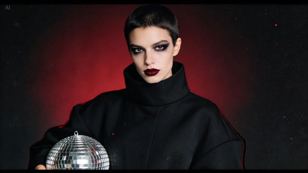
AI-generated concept portrait from the supplied asset library; the reflected-light motif is a design reference, not a depiction of a participating artist.
The lesson is the relationship between elements, not a requirement to use the same subject. A small repeated reflection or curved shape may connect the season more effectively than several unrelated elaborate scenes.
Use concept work to improve a commission brief
If the group hires a designer or illustrator, the exploration can clarify preferences and uncertainties. It should help explain the desired relationship, not demand that the artist copy a selected output exactly.
Describe which qualities matter: an open composition, a restrained palette or a sense of light passing between surfaces. Distinguish those choices from incidental details.
Ask the commissioned contributor how they would develop the idea. They may propose a more coherent or original approach than the initial concepts.
Discuss the expected deliverables, revisions, credit and intended uses before the work begins. Keep the agreement connected to the actual project rather than relying on assumptions about what a commission includes.
A clear brief respects the contributor’s expertise and gives the organization a better basis for assessing the finished work.
Let the program hierarchy do useful work
The main brochure should help someone understand the season, then find a particular event. An individual announcement should make that event’s title, date and participation route easy to locate.
Use consistent placement for repeated information. Audiences should not have to relearn where to find a booking instruction on every card.
Preserve meaningful differences between events. A workshop may need a materials note, while an exhibition may need opening hours. The design system should accommodate those needs rather than hide them.
Keep all factual copy editable. Dates, venue names and contributor credits should not be embedded only in decorative artwork.
Test the hierarchy with someone who has not helped organize the program. Ask them to find an event that interests them and explain the next step they would take.
Treat generated imagery as part of a mixed practice
The program can combine real photographs, commissioned work and clearly presented conceptual imagery. Consistency does not require pretending that all those assets were made in the same way.
The organization should understand which asset does which job. Actual venue photographs help set expectations; artist-provided images introduce the work; abstract illustrations can connect a theme.
When evaluating ai image generation tools, use the specific seasonal task rather than a general gallery comparison. Can a candidate support the chosen motif and leave room for accurate information?
Check current account and usage conditions before planning a larger set. A short trial should test the path to usable files as well as the initial appearance.
Avoid uploading private contributor material when a written description can communicate the need. A concept discussion does not automatically require access to unpublished artwork.
Review representation as carefully as appearance
A synthetic crowd can imply attendance that never occurred. A fictional portrait can look like a participating artist. An imagined interior can suggest facilities that the venue does not have.
Choose the image and caption together. If the asset establishes atmosphere, describe it as illustration rather than as documentation of the actual program.
Use authorized real material when the audience needs to see the venue, accessibility arrangements or the work being exhibited. A generated substitute may make those practical questions less clear.
Check contributor names, artwork titles and credits against approved information. A visually coherent campaign can still feel careless if it misidentifies the people whose work it promotes.
Ask contributors to review the presentation relevant to them. Their feedback can identify a mismatch in tone or context that a general design review would not reveal.
Adapt the thread to different encounters
A printed brochure, a small phone announcement and a noticeboard poster have different reading conditions. Preserve the visual relationships while changing the layout to suit each one.
A social card may introduce one event and direct the reader to complete details elsewhere. A poster needs essential information readable at the distance where it will be displayed.
Do not force a large program into one small graphic. A clear sequence of announcements can serve the audience better than a dense image containing every detail.
Preview actual exports and print a test when appropriate. Important information should not disappear because a crop changed or the type became too small.
Keep current distribution files clearly separated from drafts, especially when a schedule change affects several channels.
Gather feedback that can improve the next season
After distribution, note the questions people ask. Confusion about booking, locations or event types may reveal a communication problem the visual review did not catch.
Ask which elements helped audiences recognize the association and which made individual events distinct. Both kinds of recognition matter.
Do not attribute attendance changes to the artwork alone. Program content, timing, distribution and many other factors affect participation.
Keep the visual decisions that were useful and retire those that created extra work without helping understanding. A seasonal system should become easier to maintain through experience.
Document the changes briefly so future volunteers or collaborators can continue the work without rebuilding the reasoning.
Keep the thread flexible and human
Before the next season, return to the actual program rather than automatically copying the previous motif. A recognizable organization can change its visual expression as the work changes.
Preserve the useful foundations: clear information hierarchy, reliable credits and room for each contributor’s identity. Those practices can connect seasons even when the artwork differs.
Keep a small reference set showing successful applications at real sizes. It helps a new collaborator understand the system more effectively than a folder of unused experiments.
The strongest seasonal identity makes the association easier to recognize while giving audiences a clearer view of the people and activities it presents.
Generative exploration can contribute to that process, especially when it sharpens a brief or reveals a promising connection. The final visual thread should still belong to the program and the creative community behind it.
Prepare a short handoff note for the next person managing announcements. Identify the approved palette, the current text source and the images that need fresh contributor approval. Include one example of a successful event card and one example of the complete program layout. That small record can preserve the season’s useful decisions without turning the identity into a rigid template.
Try a three-format stress test before approving the identity. Place the same event details into a square social card, a narrow mobile listing and a printed poster. Check whether the event name, date, location and booking information remain readable at their real sizes. Then replace the workshop photograph with an exhibition image and a performance portrait. If the system only works with one type of artwork, reduce the decorative motif or adjust the layout rules. A flexible identity should make production faster while giving each contributor’s work enough room to be see

Pool Maintenance: The Hidden Business Costs of Neglecting Your Facility

Prevention Cloud: A Complete Guide to Workplace Wellness and Cloud Security

Neatie: Personalized Jewelry, Custom Necklaces, and Complete Buying Guide
Who Is Gale Burnick? The Story Of George R. R. Martin’s Ex Wife

Who Is Hermann Nicoli? The Full Story Of Candice Swanepoel’s Former Fiancé

Who Is Alicia Dove? The Life Story Of Corey Taylor’s Wife
-
Celebrity4 months ago
Who Is Gale Burnick? The Story Of George R. R. Martin’s Ex Wife
-
 Celebrity4 months ago
Who Is Hermann Nicoli? The Full Story Of Candice Swanepoel’s Former Fiancé
-
 Celebrity4 months ago
Who Is Alicia Dove? The Life Story Of Corey Taylor’s Wife
-

 Celebrity4 months ago
Meet Carole Rogers: Everything to Know About Kenny Rogers’ Daughter
-

 Celebrity4 months ago
Who Is Anna Hillinger? The Full Life Story Of Mike Shinoda’s Wife
-

 Celebrity4 months ago
Who Is Sydney Davis? The Full Story Of Billy Bush’s Ex Wife
-

 Celebrity4 months ago
Who Is Demacio Castellon? Life Story Of Nelly Furtado’s Ex Husband
-

 Blog2 months ago
What Is Sosoactive? A Complete Guide to the Digital Platform